Unknown to me at the time this painting's composition is not overly special, its formulaic.
When looking at this painting most of our eyes are drawn to Gordon standing proudly and clearly at the top of the stairs. Then our eyes naturally drift down to the enemies and circle the foot of the painting then follow back up to the general once again. There is a reason most of us follow this movement which I'll get to latter, I just want to look at some of the things I noticed when looking at this painting first.
- He is wearing darker clothing than his enemies so he stands out a little.
- He is above his enemies, on the stairs the man closest to him is almost kneeling, worshiping this British figure.
- He is standing to left while his enimies are to the right. If you read my post on 'Space In Film' you'll see the significance of this.
- He is calm and reassured while his enemies appear savage.
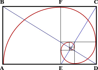
When you place the golden section over the painting the image seems to fit perfectly. The enemies are below in the larger empty section and Gordon is placed in the middle of the line on the left hand side. It's really interesting. The golden section is considered to be aesthetically pleasing and its been used throughout history, in art, architecture and even in finance. I dont quite know that much about the golden section so I'll have to do a little more reading.
The reason your eyes sort of do a circular movement while looking at this painting
 (Gordon to enemies to Gordon) is found when you create a spiral formation within the golden section. This design is found all over the place, in our culture, in nature and in the universe. Our eyes seem to travel along an invisible line that looks something like this.
 But that's not all the painting has to offer.
Now we look at the rule of thirds.
If we take the rule of thirds grid and lay it over the painting all the lines seem to be perfectly matched with the people and locations on the canvas. This painting is the perfect example of perfect composition. It ticks all the boxes!

